
 Prev
Prev


DIGITAL ANNUAL REPORT MICROSITE DESIGN
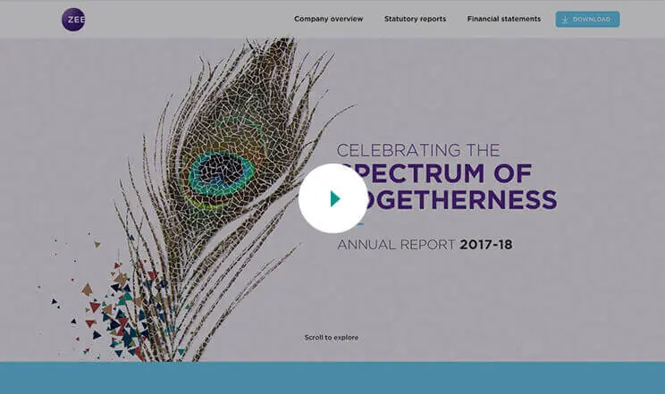
India's first private Hindi TV network, Zee Entertainment, wanted to celebrate 25 years of togetherness with its stakeholders. Instead of a boring silver jubilee theme, Zee came up with a rather vibrant ideology for its annual report--Extraordinary Together. Our sister concern Synapse used a mosaic theme to manifest this ideology throughout the print report. For its digital avatar, a PDF version wouldn't have been extraordinary at all. So our in-house digital annual report agency created a striking, concise, and easy-to-navigate 60-page microsite to host the highlights of their fiscal.

UX DESIGN FOR A
MOBILE-FIRST AUDIENCE
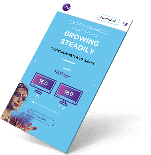
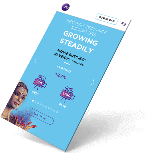
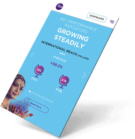
The long scroll UX of the site features bite-sized, skimmable content, especially for smartphones. Most important details lead the information hierarchy. To dive deeper, users can simply tap on 'Read More' and easily navigate back to the main page. Smart interlinking, clever segmentation of info, and delightful interactions give the microsite an edge against a PDF version of the print report. We left nothing for UX audit agencies to pinpoint.

UX DESIGN FOR A
MOBILE-FIRST AUDIENCE
The long scroll UX of the site features bite-sized, skimmable content, especially for smartphones. Most important details lead the information hierarchy. To dive deeper, users can simply tap on 'Read More' and easily navigate back to the main page. Smart interlinking, clever segmentation of info, and delightful interactions give the microsite an edge against a PDF version of the print report. We left nothing for UX audit agencies to pinpoint.
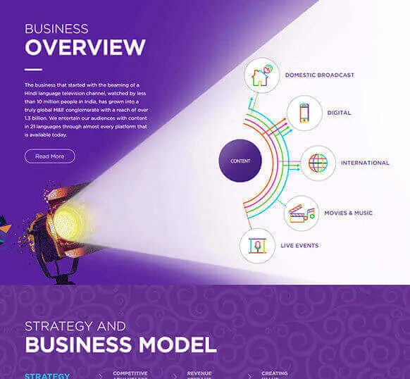
VISUAL DATA FOR
VISIBLE IMPACT
Considering the report was for an entertainment major, numbers and figures could've been anything but boring. So we visualized all the graphs and charts with depictive iconography. A hint of motion UI in all the data-points made them come alive. We re-imagined smart arts representing processes and models, making them self-explanatory, while subtly reflecting the Extraordinary Together theme.
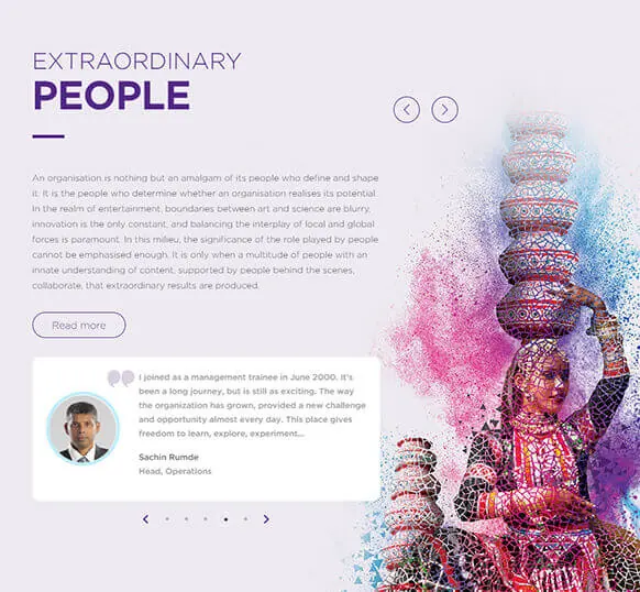
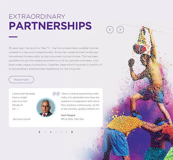
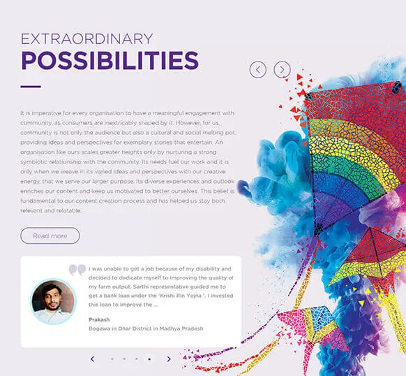
UI DESIGN THAT
DRAMATIZES AND
DELIGHTS
Highly visual and animated data only tells half of Zee's story. The other half is illustrated with high-impact imagery composed of mosaic tiles. Visual UI design featuring burst of colours and seamless transitions augment the drama. Animated explosion of mosaic tiles (motion UI) further strengthens the theme.


